15 October, 2025 | News
Choosing colors is one of the most important decisions in any interior design project. The color palette defines the atmosphere, influences mood, and shapes how we perceive spaces.
The wrong color can make a room feel smaller, colder, or cluttered. On the other hand, a harmonious combination can transform even the simplest room into a balanced, pleasant space to live in.
Every color evokes different emotions. Before choosing a palette, ask yourself: How do I want to feel in this room?
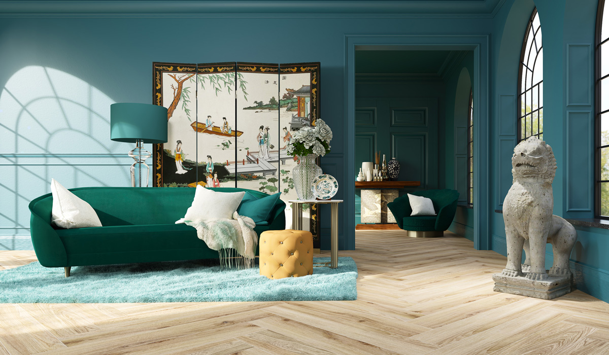
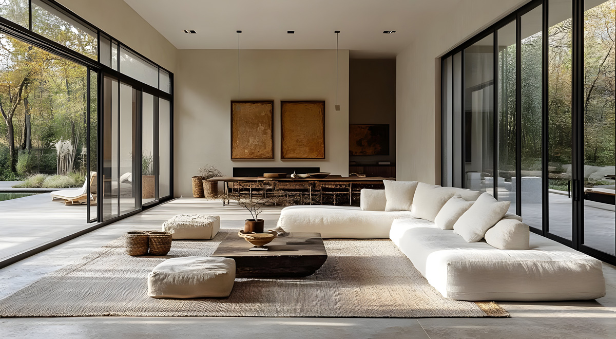
Living room: Warm, neutral tones (beige, taupe, sand) promote sociability and comfort.
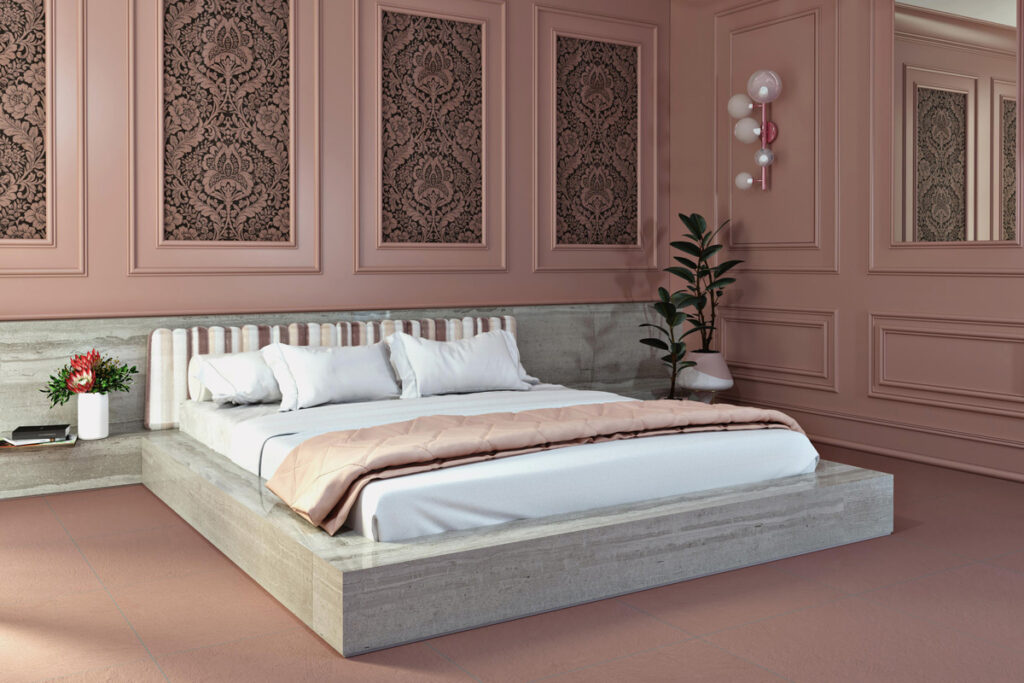
Bedroom: Soft shades like blue, pearl gray, and lavender encourage relaxation.
Kitchen: Energizing hues such as mustard yellow or sage green stimulate appetite and creativity.
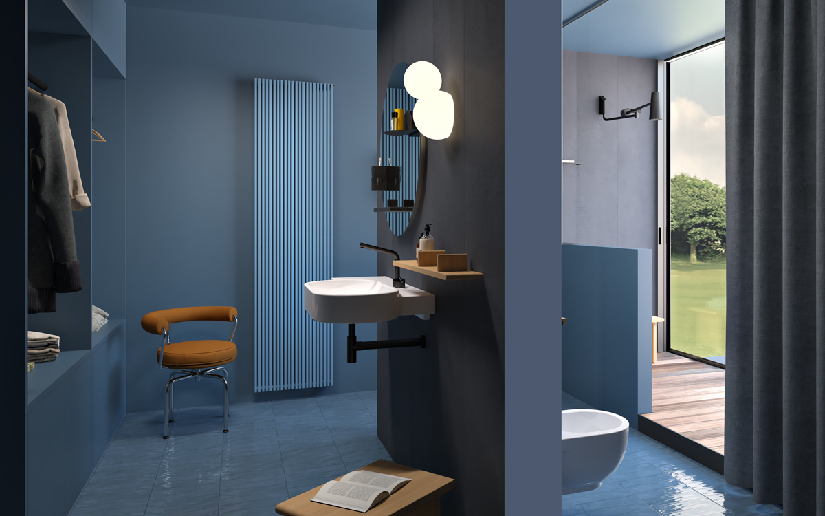
Bathroom: Light blues and whites evoke cleanliness and freshness.
Choose a core emotion (calm, energy, elegance, intimacy) and build your palette around it.
A timeless interior design principle:
60% dominant color (walls and floors)
30% secondary color (main furniture)
10% accent color (accessories, decorations, textiles)
This proportion keeps visual balance and allows you to play with contrasts without creating confusion.
For example, a room with beige walls (60%), taupe-gray furniture (30%), and teal accents (10%) will feel harmonious and sophisticated.
Light completely changes how we perceive color. A tone that looks warm in daylight can appear cold under LED lighting.
North-facing rooms: Benefit from warm tones (terracotta, honey, peach).
South-facing rooms: Can enhance cool tones (light blue, sage green).
Low-light areas (bathrooms, corridors): Use light, reflective shades like ivory white or pale gray.
In color design, nothing is random. Here are some common associations:
Blue: Calm, focus (ideal for study, bathroom, or bedroom).
Green: Balance, nature (great for living rooms or kitchens).
Yellow: Optimism, energy (perfect for small or dark spaces).
Red: Passion, stimulation (best used in small doses).
Neutrals (white, gray, beige): Versatile and relaxing, an excellent base for any style.
Incorporating color psychology helps you create spaces that reflect the personality of those who live in them.
A balanced palette doesn’t mean a boring one. The secret lies in using contrast wisely:
– Analogous colors (close on the color wheel, like green and blue) create harmony.
– Complementary colors (opposite, like blue and orange) add energy and movement.
– Monochromatic schemes (variations of one hue) produce an elegant, soothing effect.
Each style has its own “color grammar”:
Scandinavian: White, light wood, gray, and touches of black.
Boho chic: Terracotta, olive green, mustard, and golden accents.
Industrial: Black, charcoal, brick, and silver.
Mediterranean: Sea blue, white, sand, and ochre.
Un’ottima palette valorizza i materiali e rafforza lo stile scelto, senza sopraffarlo.
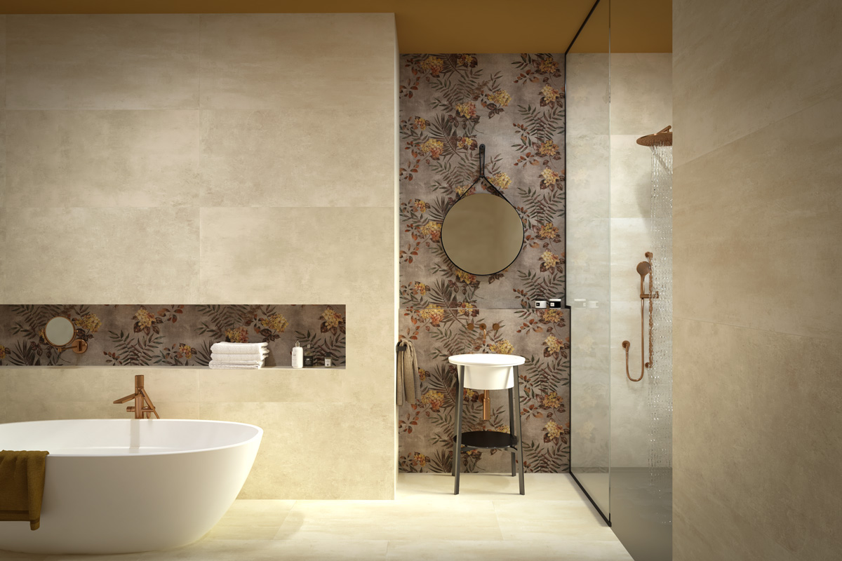
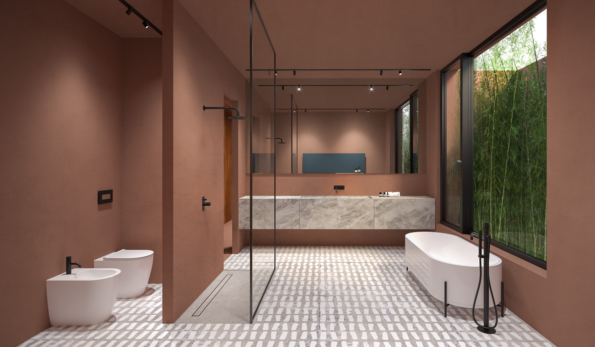
The bathroom is one of the trickiest spaces to design in terms of color—it must feel clean, relaxing, and bright, while still reflecting the home’s overall style. The bathroom color palette affects both spatial perception and daily sensory experience.
Light Colors to Brighten and Enlarge
In small or windowless bathrooms, light and neutral tones are ideal.
Pearl white, light gray, sandy beige, or pale sage green reflect light and make the space feel airy.
Combined with natural materials like light wood or stone, they create an elegant, spa-like effect.
Natural Tones and Textured Accents
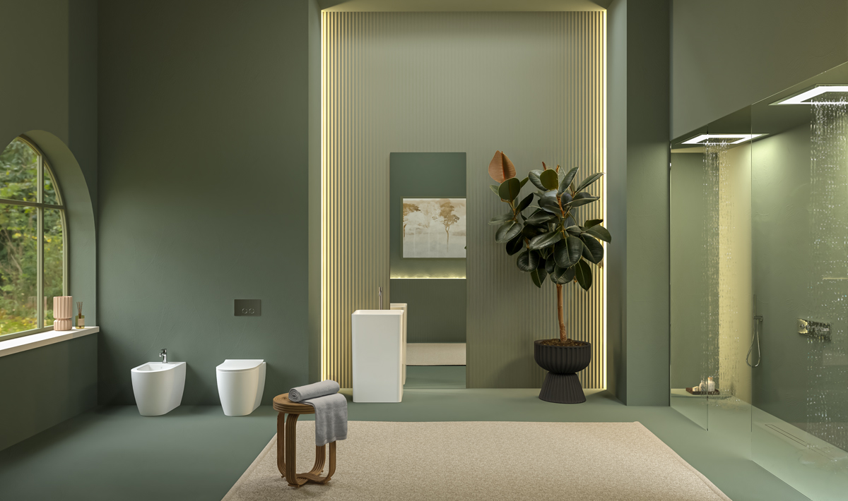
The “natural bathroom” trend keeps growing. Combine nature-inspired tones—terracotta, ochre, sage green, ivory—with textures such as wood, linen, bamboo, or raw stone.
These combinations evoke warmth and comfort, perfect for relaxation and well-being.
Pops of Color for Personality and Contrast
If you prefer a modern, lively bathroom, add an accent color.
Navy blue, for instance, conveys elegance and depth, especially when paired with white or marble.
Alternatively, petrol blue or forest green suit contemporary bathrooms, balanced by golden or matte black details.
Choosing the perfect color palette is not just a matter of taste—it’s about balancing emotion, light, and function.
Experiment, observe, and let yourself be guided by the atmosphere you want to create: every hue tells a story, and your home deserves to tell yours.